London Fashion Week is coming up and that means a huge array of new inspiration will be strutting down the runway ready for us Fashion Illustrators to watch and respond to. I’m going to take you through how I create my illustrations step by step so you’re prepared to be let loose on the runways and start drawing.
For this piece I used Liquitex Heavy Body Paints, Derwent Line Maker and a Gelly Roll gel pen to create a finished illustration.
Step 1
I normally do a few small sketches to finalise the pose, once that’s sorted I’ll start sketching the initial figure out. The paper I’ve been using lately is a2 Daler-Rowney finegrain heavy weight, it’s fun to work large scale as you can get more detail in, this paper isn’t too textured so the fine liner can glide across easily and it’s a good paper to hold a decent amount of paint without warping.
I sketch using a 2b pencil as it’s softer and is smoother across the page, I would say be a bit careful to not press down too hard as B pencils are much harsher so they’re more difficult to rub off the paper once inking. If you choose a H pencil they are lighter in tone and easily erasable but can indent the paper as they’re a hard pencil so be careful!
Step 2
Now once the general gist of the figure is sketched out I’ll use this 0.1. Derwent Line Maker to go over the pencilled lines confidently. I use a 0.1 nib as it’s incredibly thin and won’t smudge when the pencil lines are being erased. I don’t worry too much about details or line variation at this stage because the paint will cover most of the initial ink so it’s just here as a guide.
Step 3
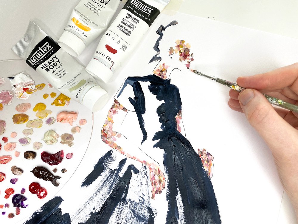
Now onto the fun bit! I use Liquitex Heavy Body Acrylic in a lot of different colours to build up my skin tones, the paint is incredibly thick and opaque so the brush strokes and texture it adds is beautiful. My go to colours for skin tones are Turners Yellow, Portrait Pink, Burnt Umber, Parchment, Quinacridone red orange, Violet and White!
The way I paint skin is to layer up these tones individually in a kind of impressionist way, applying the darker tones such as purple and brown in areas of shadow, yellow in areas of highlight. I keep applying tiny strokes of paint until I feel the area has enough depth.
Step 4
This steps a bit more gestural than the fiddly skin tones, I use Payne’s Gray as my black as it’s a thicker paint than the other blacks in the Liquitex range so you see the brushstrokes a lot clearer.
Using this paint and a thicker brush I load up the paint and start from the top of the dress and work my way down, making sure the paint strokes echo the way the dress falls to give an illusion of shape.
My style of fashion illustration is pretty abstract so I won’t fill the entire dress in and leave areas of white to let the viewer fill those in. I normally gauge this by leaving an area where the highlight of the dress would be or using black purely to highlight the shape/silhouette of the garment.
Step 5
Once the black paint has fully dried it’s time to crack on with the dresses pattern, I’ll be using Liquitex Heavy body again but their amazing iridescent range. The golds are gorgeous and shine like no other, so I just use this mixed in with a green or a pink to make up the floral print, this is a fiddly part that looks better the more you do so just use a range of delicate strokes and big swooping strokes so it doesn’t all look one note.
Step 6
Now I’ve been attacking this dress with gold paint for about an hour it’s time to use the iridescent silver to add some little flecks of highlight to the pattern so it doesn’t all read as flat. Use this sparingly just to balance out the tonal range in the fashion illustration.
Step 7
My fave bit! In my experience a good white gel pen and save an illustration. I’m using a Gelly roll white gel pen to add some more highlights, clean up some details and put in some leaves etc into the more abstract paint strokes to give it more detail and a cleaner look.
Step 8
Now your inked lines are probably barely visible from rubbing out the pencil lines and painting the entire piece so in this final step I’d grab a 0.3 and a 0.8 Derwent Line Maker and re ink my lines. Making sure to apply a varying pressure to the nib to get a different thickness of line which helps add depth to the piece. I use a 0.3mm to reink the face and a 0.8mm to reink the dress outline.
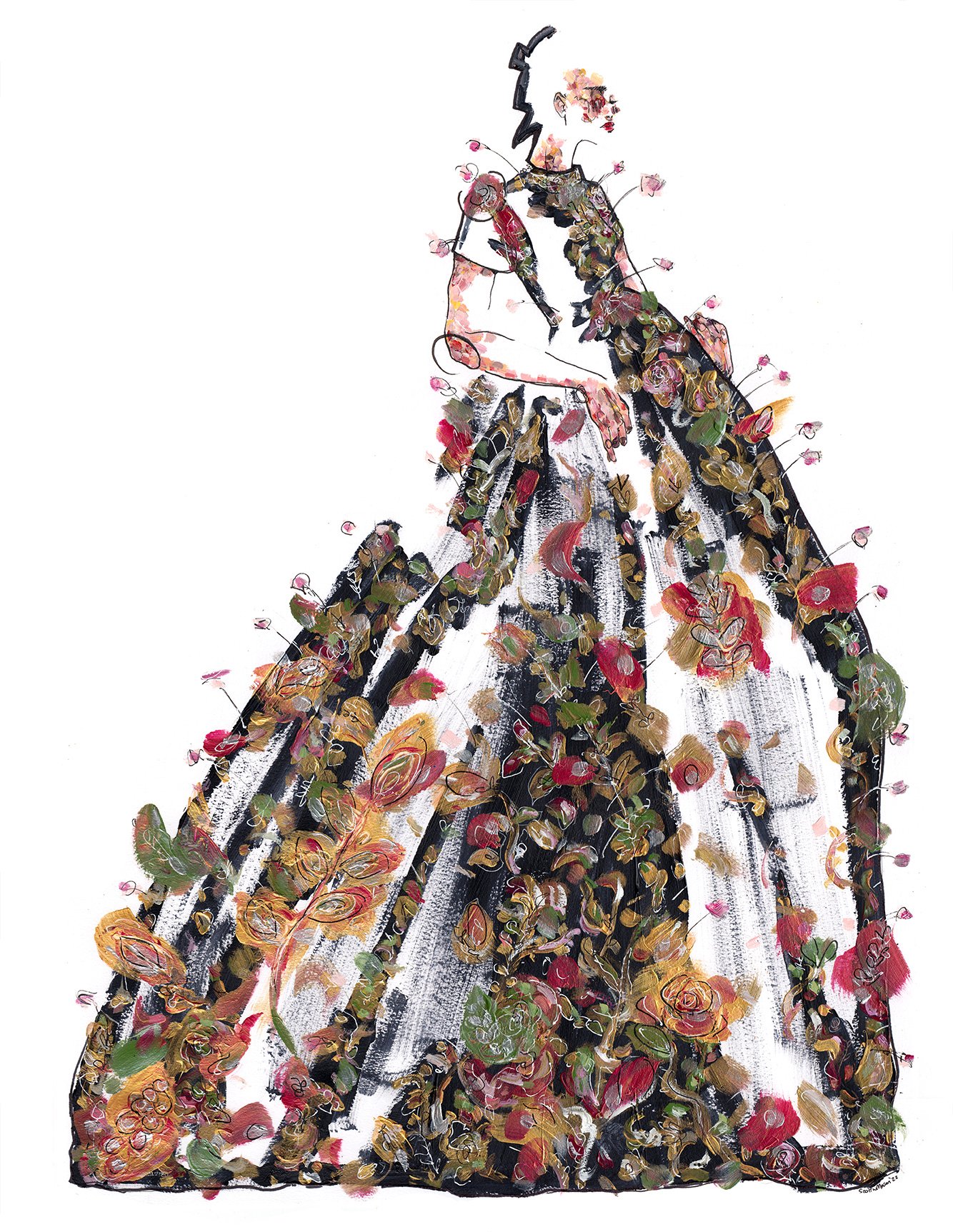
And we’re finished! Here’s the final fashion illustration, I love tackling a delicate print like this at least once every fashion week but you can still use these tips to draw something less intricate and go for strong silhouettes or bold colours.
Now go observe the runways, crack out your paints and get creative with some fashion illustration!
If you’re looking for a course to help improve your fashion illustration, look no further! An 8 week course designed to hone your skills with exercises, homework and feedback sessions, sign up below:


